IELTS – Writing TASK 1 – Giriş cümlesi örnekleri
Bildiğiniz gibi ielts sınavında writing bölümü task1 ve task2 olarak ikiye ayrılmıştır. Task1 de karşımıza çıkabilcek 5 tane farklı soru vardır. Bular ; Çizgi grafiği , Pasta dilimi , Bar grafiği , Akış diyagramı ve Tablodur . Sorumuz ne olursa olsun yazacağımız paragrafı kalıplaştırıp sınavda soruya göre birşeyler yazmak yerine önceden kalıp bir paragraf oluşturup , soruya göre üzerinde değişiklik yaparak hem hızlı hemde gerekli olan puan kriterlerine uygun bir paragraf yazabiliriz.
NOT : Giriş cümlesi 1 – 2 cümle ve yaklaşık 20-30 kelimeden oluşmalı , Soruda verilen cümlenin aynısı olmamalı
1. Örnek Table
|
2000 |
2005 |
2009 |
|
| Specialist Schools | 12% | 11% | 10% |
| Grammar Schools | 24% | 19% | 12% |
| Voluntary-controlled Schools | 52% | 38% | 20% |
| Community Schools | 12% | 32% | 58% |
The table shows the percentage of school children attending four different types of secondary school from 2000 to 2009.the coloums includes specialist schools, grammar schools , voluntary-controlled schools and community schoools while the rows includes 2000 , 2005 and 2009.
2. Örnek pie chart
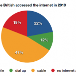
the pie chart shows percantages of accessed the internet in British in 2010.
3. Örnek bar graph
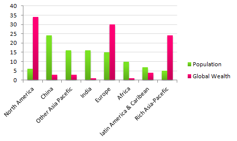
The bar graph shows percantages of global population and distibution of wealth by region.
4. Örnek Line graph
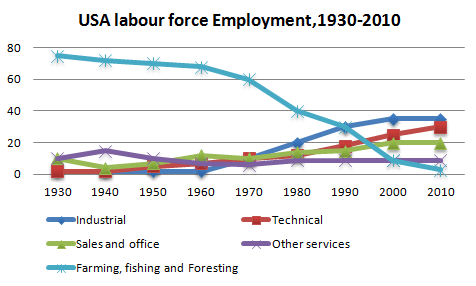
The line graph shows number of employment patterns in the USA between 1930 and 2010.
5. Örnek flow chart (diagram)
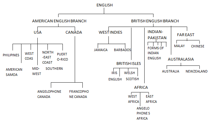
the diagram shows the relationship between a number of different languages .
Yukarıdaki örneklerde gördüğünüz gibi yapı herzaman aynıdır. Yani ;
The ( grafiğin ismi ) + shows + (anumbers of / percantage of / amount of ) + Soruda verilen bilgiler + in 1990 / between 2000 and 2010
şeklinde cümleyi oluşturabiliriz.
Benzeri Giriş Cümlesi Örnekleri:
– The Line graph shows the number of people who moved to the UK from Turkey and Spain between 1900 and 2000.
– The bar graph demonstrates the annual rainfall in Turkey and UK from January to December in 2010.
– The table illustrates the sales made at coffee shop from April to August.
– The pie chart indicates the types of music audio media used in 1990, 2000 and 2010 respectively.
– The flow chart describes the five phases in the hiring process for a computer company in 2012.
– The chart illustrates the number of cars (which was) exported in the USA through the period starting from 2000 until 2005.
